Natural Light – Part 3
post by: Peter Zimmerman
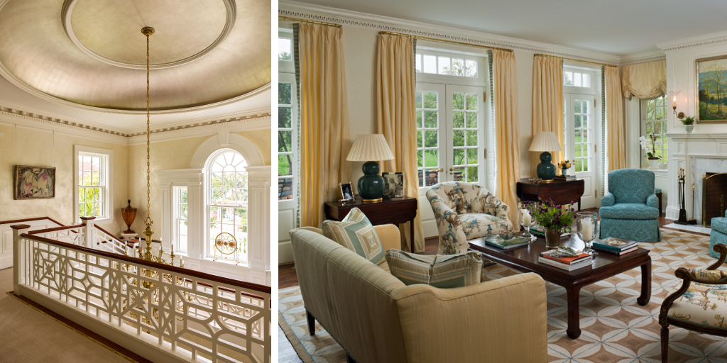
CirculationA common complaint heard from clients living in old houses is that certain rooms are never used; they become wasted spaces. The reason: they are closed off, they are more formal and they are not a part of the natural circulation within the house – out of sight, out of mind. We believe that when a space is seen and appreciated daily, it feels used and becomes integrated into one’s life. So through a conscious design effort, we control the circulation path from the first to the second floors. Also, in keeping with the proportions of traditional rooms, we solve the “closed off” feeling by creating larger doorways, which create visual accessibility and views. When those rooms are opened up and reinserted into the daily circulation path, they are seen, appreciated and not only feel used but are often used more frequently.
The rooms in our new old houses do not bleed together; there is a sequence of rooms, and they are clearly defined. It is my role to provide clients with the feeling of classically proportioned, well-defined rooms, while giving them something more. Rooms are traditional in that they have four corners and an opening, which is cased even though it may be large. Casing an opening visually breaks the plane of the ceiling and creates a sense of proper proportion. This is also true in our use of thresholds, which allows us to change the floor surface either by changing its direction or by changing the materials used. Now there is a clear definition of space while a feeling of openness has been maintained.

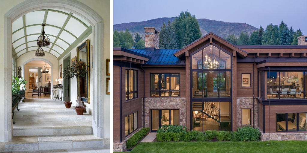
There is sophistication to this experience in that the mind’s eye is broken by non-continuous ceiling and floor planes. One can see out through several spaces, which creates an appropriate layering of spaces, thus allowing for the modulation of compressions and expansions within the procession. The viewer feels deep inside the house, yet feels a connection to the outside. We call this punctuating movement; very clearly, a viewer is leaving one space and entering a new one, often without awareness. This is what we mean when we speak about the overall experience; it’s not necessarily quantifiable, it just evokes visceral reaction.
We view the house’s exterior, which is primary, in a slightly different way. When we physically make a larger opening in an exterior wall, which may seem inappropriately scaled at first, we mask its size behind certain elements that give the appearance of a more traditional façade. For example, we may use either a glass porch or an archetype of an orangery to cover a large opening in order to maintain the quality of light and return a sense of balance to the house’s scale and proportion. The solution to the problem, however, must be appropriate to the particular situation. This is where the challenges lie: finding the appropriate answers.
Our firm strives for design that creates a sense of transparency inside and out. Beautifully landscaped outside spaces are really exterior rooms; they are extensions of other rooms. There is never just an inside and an outside, though we often encourage our viewers to see outside by utilizing axial views that imply there are spaces and experiences beyond what one can see that are visually and mentally important. Recession is equally as important as the procession.

Good architecture is a subtle, sophisticated dance between the inside and the outside. Neither one can take command of the other. It’s like a tango, or a good relationship; it requires balance, harmony of compressions and expansions and openness to trying as many approaches as necessary to find the right solution.
When we design a new old house, there is never one answer or one solution. Each situation is unique, because multiple issues are involved. Knowing when and how to break the architectural rules that create a rhythm or a sequence of spaces, removing the monotony and creating unique, individual punctuations in each space – this is what delights clients.
